#OnTheBlog Update
I’m currently on spring break this week (yay!) and I wanted to keep things kind of simple. Right now, I’m in Denver hanging out with my family, enjoying the weather, and taking a nice mental break from college. I don’t have a lot of time to work on a post, so I thought I’d give you a bit of an update about what’s been going on here at Living the Gray Life! I never addressed some of the major changes that I made here, so I thought now would be the perfect time!
I don’t know if you noticed, but Living the Gray Life recently got a complete overhaul. Ok, well it wasn’t super recent, but it was within the last two months. That’s pretty recent, right? Back in January, I made a spur of the moment decision to change my theme!
I was tired of the old look. It wasn’t clean, I didn’t like the layout, and it didn’t reflect my personality. It looked like a newbie blog. I switched from my old theme to the WordPress Twenty Sixteen and it’s my new fav.
HEADERS & LOGO
With a complete blog overhaul comes new design! Designing things is one of my favorite parts of the blogging process. I love how you can reflect your personality in a few colors and images. You may have noticed the new header.
I used Adobe Illustrator to create this. In fact, I use Illustrator to create almost everything on here! I’m personally in love with geometric designs (really considering getting a small geometric tattoo) and simplicity. I decided to go with triangles and limit my self to around four colors: coral/orange, light blue, white, and grey. Many of you may not know why my blog is called Living the Gray Life, but I’m going to let you in on a little secret here. My middle name is Gray. See, it all makes sense now! I’ve been working on updating all of my social media banners and headers and stuff with the new designs. What do you think of the new look?
COLORS
Color plays a huge role in my life, and I also wanted it to play a large role on my blog. Ever since Living the Gray Life started in June 2015, I have been centered around black, white, grey, and coral. Personally those are my favorite combinations! I love the pop of color that the coral gives, and the black and white is just a classic look. When I did my blog overhaul, I decided to go with a blue as well! You know, gotta keep my options open! Here are the specific colors that I use:
I have no idea why this orange doesn’t to appear to be as vibrant as the other oranges on the page. I left my laptop that has Illustrator and Photoshop on it back at USC, so I’m just going off having to learn Gimp and Canva for the week.
FONTS
Fonts, fonts, fonts. What blogger doesn’t love fonts? For me, I’ve yet to find a really amazing brush script that I’m in love with. If you have any suggestions that are free, please, please, please leave them in the comments below! My favorite fonts are:
FontSquirrel is my favorite site to find free fonts on. I’m a college student with a $0 budget, and free things are my favorite.
SOCIAL MEDIA
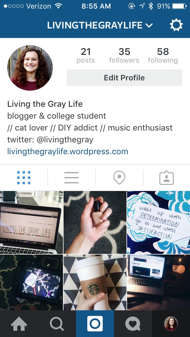
I NOW HAVE AN INSTAGRAM! Sorry for yelling that, but literally Instagram is my new obsession. I post on it almost every day (and sometimes multiple times a day) and I love it. Make sure to leave your Instagram in the comments and I’ll follow you! I’m trying to work on my “theme,” but it’s not going that well, haha. I’m striving for the stereotypical dark colors, blue tones, and whites. I’m trying here. That’s all I can say.
I also updated my social media links in the sidebar! I made the buttons myself and then used an image map to create the links. Sounds complicated, but it’s actually super easy.
I’ve been loving all of the updates I’ve made to the blog. I feel like it’s really reflecting my personal style and who I am. What are your opinions on the updates? Anything that you’d love to see added? I love hearing from you all!
~Abigail Gray


