I Updated Old Pinterest Graphics and My Views Tripled

Oh man. It’s been so long since I’ve actually talked about blogging on here! It’s been over a year since I directly addressed the topic, and it’s been about two years since I was regularly posting my tips & tricks to navigate the blogging world.
I’ve been doing this whole blogging thing for over 4 years now, so everything is essentially on autopilot. I write new posts and keep my Tailwind queue full, and that’s about it.
Since making the leap of starting my own business and working for myself full-time, I realized that I also need to be dedicating as much effort to my blog as I do my business if I want it to succeed… okay maybe not the same amount of effort, but I generally need to dedicate a bit more time to have my blog succeed. The first step to making that happen was to look at my analytics and refresh my older blog content that was doing well.
Focusing on My Top Posts
The first step I took was to look at my top posts in Google Analytics. Typically, college posts are the most popular for me and are what drive the majority of my traffic.
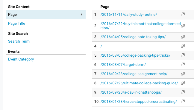
From my analytics, I could see that the following posts should be my #1 priority when updating old graphics:
- Daily Study Routine
- Buy This, Not That: College Dorm Edition
- College Note Taking Tips
- Here’s How to Stay on Top of Your Assignments
- College Items Worth the Splurge
** Here’s a little tip if you’re wanting to create content that is popular on Pinterest. Pinterest users typically start searching for specific things about 1-3 months in advance of the actual event. This goes for major holidays, events, and things such as starting college or heading back to college. I don’t know about you, but when I went off to college, I was scouring Pinterest for advice before I finished my senior year of high school. So in terms of college-related posts like dorm decor, dorm essentials, doing well this semester, and so on, June/July/August are prime months for those topics. If you’re wanting to target the college audience, publish college relevant stuff during that time. **
Creating New Graphics
During this time, I was listening to a lot of what Katherine McDermott from the Swipe Up podcast. She works started her own business doing influencer PR and is killing it, so when she said she was focusing on Pinterest, I knew I should probably focus more on Pinterest as well.
There’s a bunch of stats out there that talk about creating the ideal Pinterest graphic and specific techniques to use to capture the user’s attention. A big she mentioned was to use warmer colors like reds, pinks, oranges, and such. They apparently are much more effective than using cool colors like blues, greens, etc.
The Old
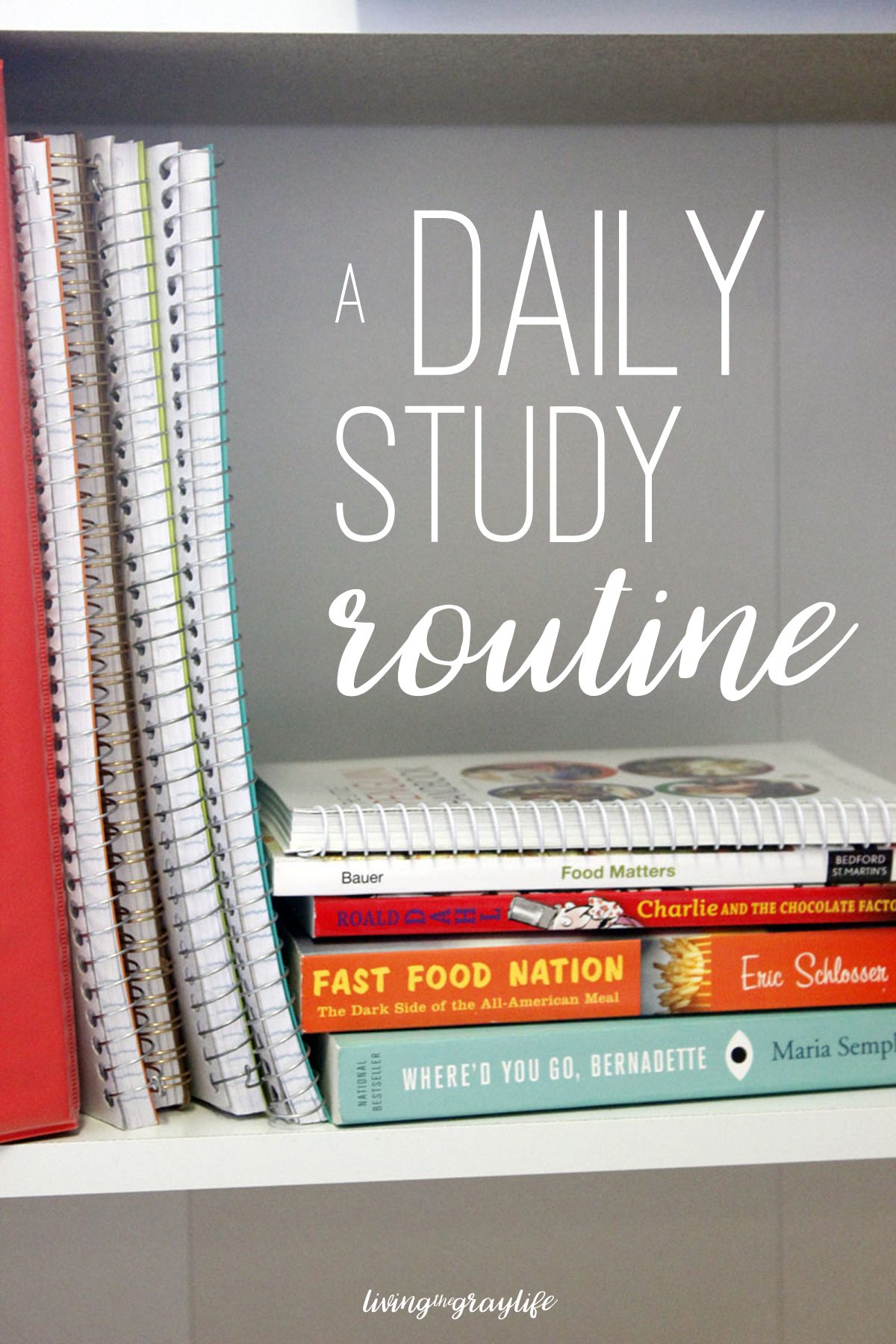
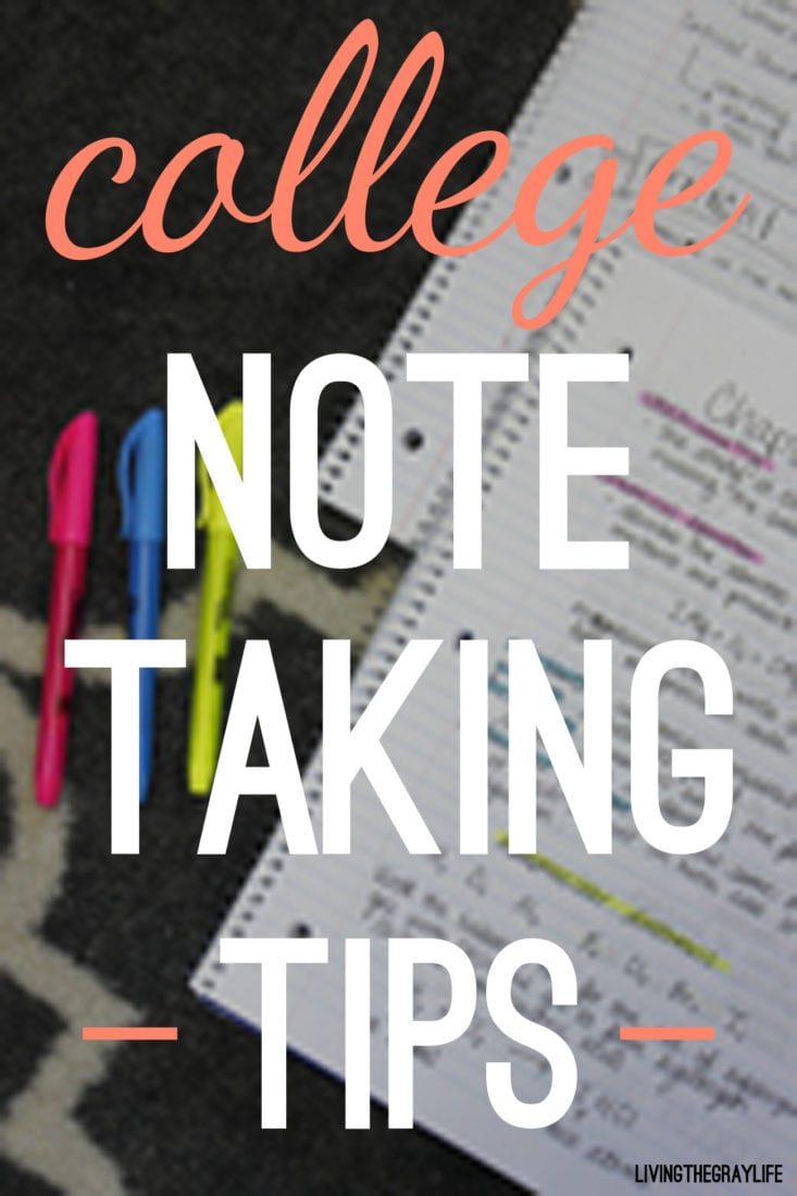
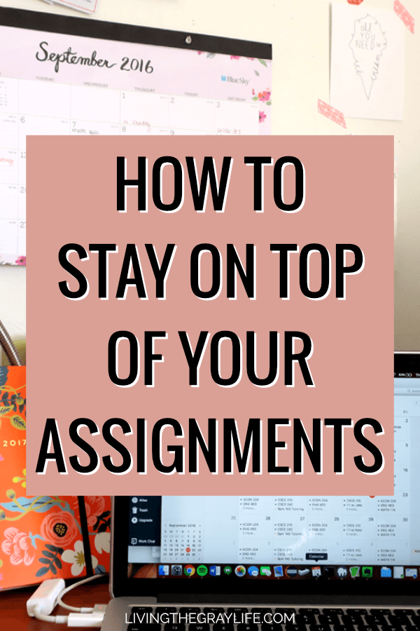
As you can see, the Pinterest images were all over the place. They didn’t have much of a consistent theme, they were lacking in overall attractiveness, and they no longer fit the current branding of Living the Gray Life.
These posts were written over a span of two years. A lot of blog changes and rebranding happened during those two years which definitely attributed to the hodgepodge of cover images.
The New
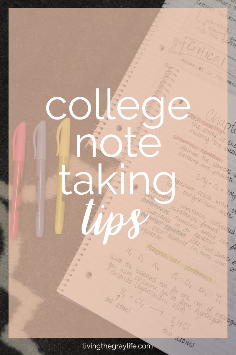
I look at these and my mind just goes “ahhhhh”. They’re so much more appealing, and they 100% fit the current branding of Living the Gray Life.
I took some inspo from the cover images of some of my favorite bloggers (Gabby I’m looking at you) and integrated those aspects into my designs. I stuck with warmer tones and colors that enhanced the images rather than being a distraction.
Uploading to Pinterest & Scheduling
I feel that there are two ways to go about doing this. 1. Add the new pin to the posts on the blog and then save to Pinterest from there or 2. Upload the new pin directly to Pinterest and assign the URL and caption in the Pinterest pin creator.
I opted for option #2.
By uploading directly to Pinterest, I could optimize the pin description and add hashtags without messing with the alt tag of the image if I uploaded it to the blog first. If you didn’t know, you’re actually not supposed to use the image alt tag to hold your Pinterest description. There’s a different tag called pin-description that you should use on your images instead…
I’m trying to figure out a way to make a widget or plugin that I don’t have to pay for that will create a new text box on the media uploader to allow me to add the pin description without having to go into the code of the image. Did that make sense? Probably not and I definitely went on a bit of a ramble there. Okay, back to the actual topic of the post.
The Results
At first, I didn’t think much of it. I remember pulling up my analytics on July 26th and seeing the spike and traffic. That’s when I knew I’d done something right.
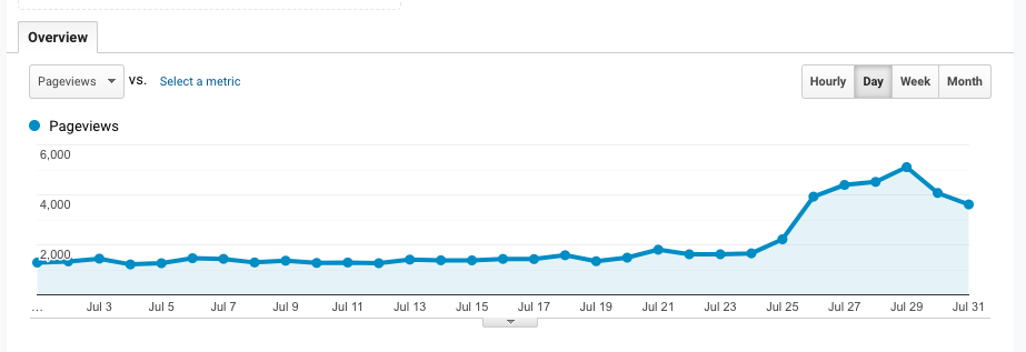
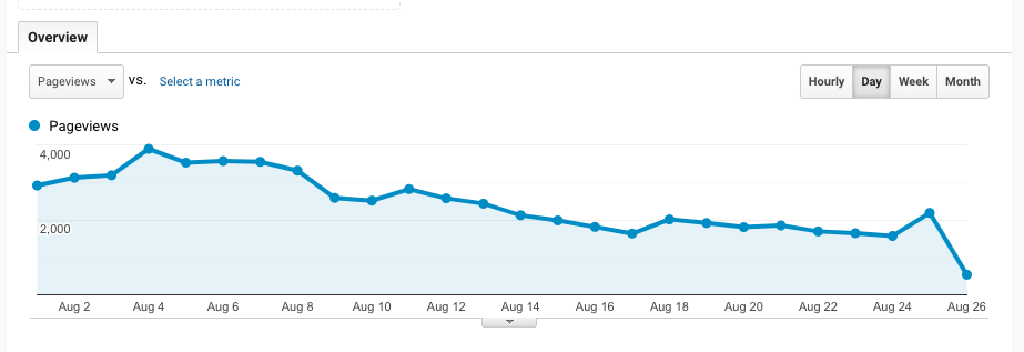
As you can see, my views jumped tremendously. There was a point where I hit 5,000 views in one day. Like what?? Hello? Is this real?
I know this spike in traffic won’t last for forever, and the trend is already starting to die off. But it doesn’t take away from the fact that what I did actually worked.
This little experiment goes to show just how important Pinterest is in driving people to my blog and just how powerful Pinterest is. Knowing the results of this, I don’t think I’ll let Pinterest slip to the back burner as much anymore, and I will 100% be keeping my eyes on my analytics more often.
Moral of the story: your analytics are your friend and don’t disregard the valuable information that they provide. I’m still in shock that what I did actually had such a strong impact on my traffic. I definitely won’t be ignoring the signs any time soon, and I will 100% be implementing this on some of my other posts as well!
~abigail gray
