Let’s Talk Media Kits
This isn’t my usual fitness or college type of content, but I do post about blogging tips & tricks on here from time to time because after all, this blog takes up 85% of my free time. That other 15% is spent with my cat or watching YouTube videos, but let’s not talk about that.
A few weeks ago I posted a boomerang on my Insta story of my media kit that I had just revamped and finished. Surprisingly, I had several people reply to that story and ask about the media kit, how I made it, what to include, and all that jazzy stuff. Well I’m here to tell y’all all about how I made my media kit, what I included, my inspiration, and what my prior media kits looked like as well.
If you’ve been in an around the blogging world for a while, you’ve probably heard about this so-called media kit and how important it is to have one if you want to land sponsorships and/or partnerships with brands.
It seems to be all bloggers talk about when it comes to monetizing your blog, but no bloggers really show you exactly what’s in their media kit and what their media kit looks like. I get that people don’t like to talk about numbers and that’s primarily what’s included in a media kit. But I like to be transparent, I’m not going to hide my stats from you, and I want you to benefit from this as well!
What to Include
There are SO many things that you can include in your media kit, it’s not even funny. But here’s my take on the essentials.
Logo/Blog Name
Would you create a resume without putting your name at the top? No. Your name and your resume is just like your blog’s logo and your media kit. It introduces your brand, let’s the reader know what you’re talking about, and creates the branding for your media kit.
Headshot
A blog is a highly visual thing — I mean we don’t spend hours editing photos and creating visuals for nothing. Your media kit should just be an extension of your blog. Include a photo of yourself so they know who they’re talking to and it makes it look more professional. It doesn’t have to be some professional looking photo. Take your profile picture from Twitter and Instagram!
Biography
Explain who you are, what you do, and why you blog. I like to include that I’m a student, where I go to school, what my major is, and just some fun facts about me. Usually it includes coffee, cats, and the gym.
About the Blog
This is the meat of your media kit right here. Create a killer ‘about the blog’ section and you’re golden. Explain what you hope your blog does, what your readers get from it, and what content you like to feature. For me, mine is all about inspiring and motivating college students to adapt a healthy lifestyle and become comfortable in the gym and with themselves.
Monthly Stats
If you’re worried that your monthly stats aren’t impressive enough to include, you’re wrong. A small reach is still something, and bloggers preach it all the time, but a smaller more engaged audience is much better than a huge reach with little to no engagement at all. I either include the prior month’s stats if they’re very impressive, or I’ll take the average of the past three months to create a better overview of my reach.
- Pageviews
- Unique visitors
- Bounce rate (only if you have an impressively low one)
- Subscribers (for your newsletter)
Social Stats
This shows your social reach. I choose to include my Twitter, Instagram, Facebook, and Pinterest followings. Don’t forget to include your social handles for each!
Services Provided
Set aside a small section of your media kit to let brands know what you offer in regards to partnerships and sponsorships. Some options include:
- Sponsored posts
- Product placement
- Brand ambassadorship
- Giveaways
- Social media promotion
Contact Information
If you don’t include your contact info, how are brands going to know how to contact you? You can always create a separate email just for your personal blog stuff. It helps separate your emails and know how people got your information. I always include:
- Blog URL
Optional Sections
Optional sections to include:
- Feedback from brands and/or readers
- Services provided
- Pricing
- Prior brand collaborations
Layout
A media kit is just like anything in life, you can just keep adding things and make it as elaborate as you’d like. Personally, I like clean, cut, to the point media kits that don’t include all the bells and whistles. It conveys all of your information in an easy-to-read fashion.
It’s just like a resume but this time it’s for your blog. If someone takes a look at it and it’s a mess, it’s unorganized, etc. they’re probably just going to go on to the next one.
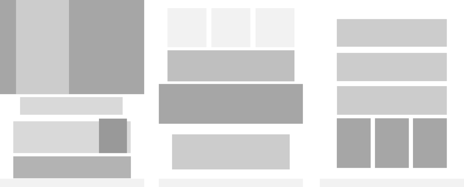
See how clean that layout is? It’s not crowded, there’s plenty of white space, and each section is clearly divided.
Here’s the goal: Use as the least amount of elements possible to convey your message.
Design Inspiration
When it comes to me and design inspiration, I like to take elements from different sources across Pinterest and combine them to form my own. I fell in love with this media kit because of the visual impact. This one is great because of the subtle color and incorporation of images. I’m obsessed with this one because I’m a sucker for black and white paired with colorful imagery not to mention the use of outlined boxes.
Branding also plays a huge role in the design of your media kit. You want your media kit to be an extension of your blog. Include the same colors, fonts, and logo. (check out my Blog FAQ page if you ever have technical or design questions about the blog)
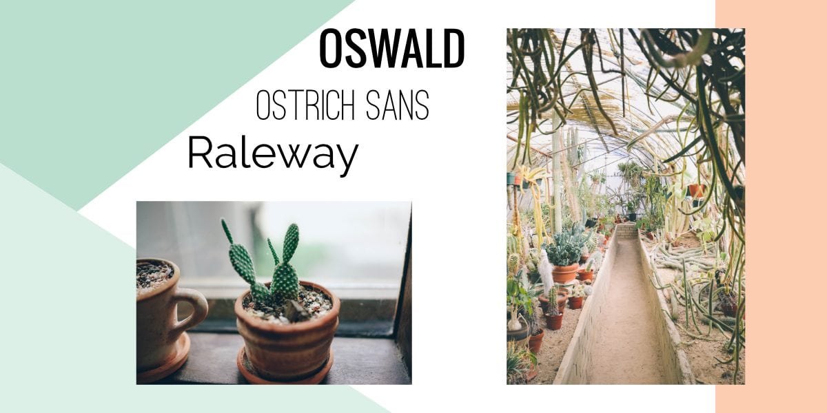
You may have created a mood board for your blog, and I recommend doing the same with your media kit.
To include even more of your personality in your media kit, pull your favorite Instagram photos and use those to create visual dividing lines to break up your content. It’s a great way to include examples of your social media posts without straight up saying “here’s an example of my Instagram content.”
How to Make
Okay first things first. It’s going to take a lot of trial and error. Your first media kit is not going to be your best, and it takes time to work out all of the kinks.
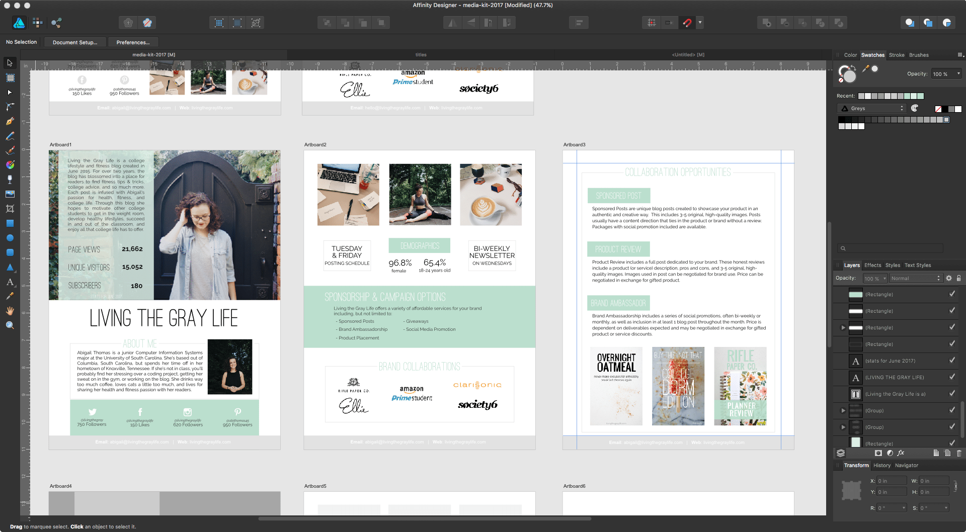
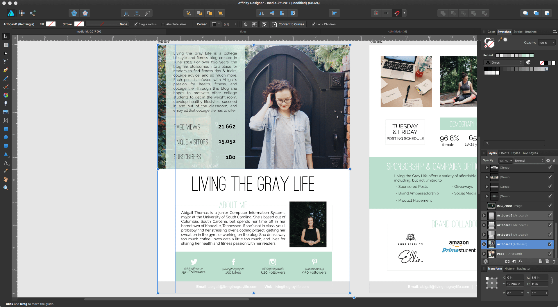
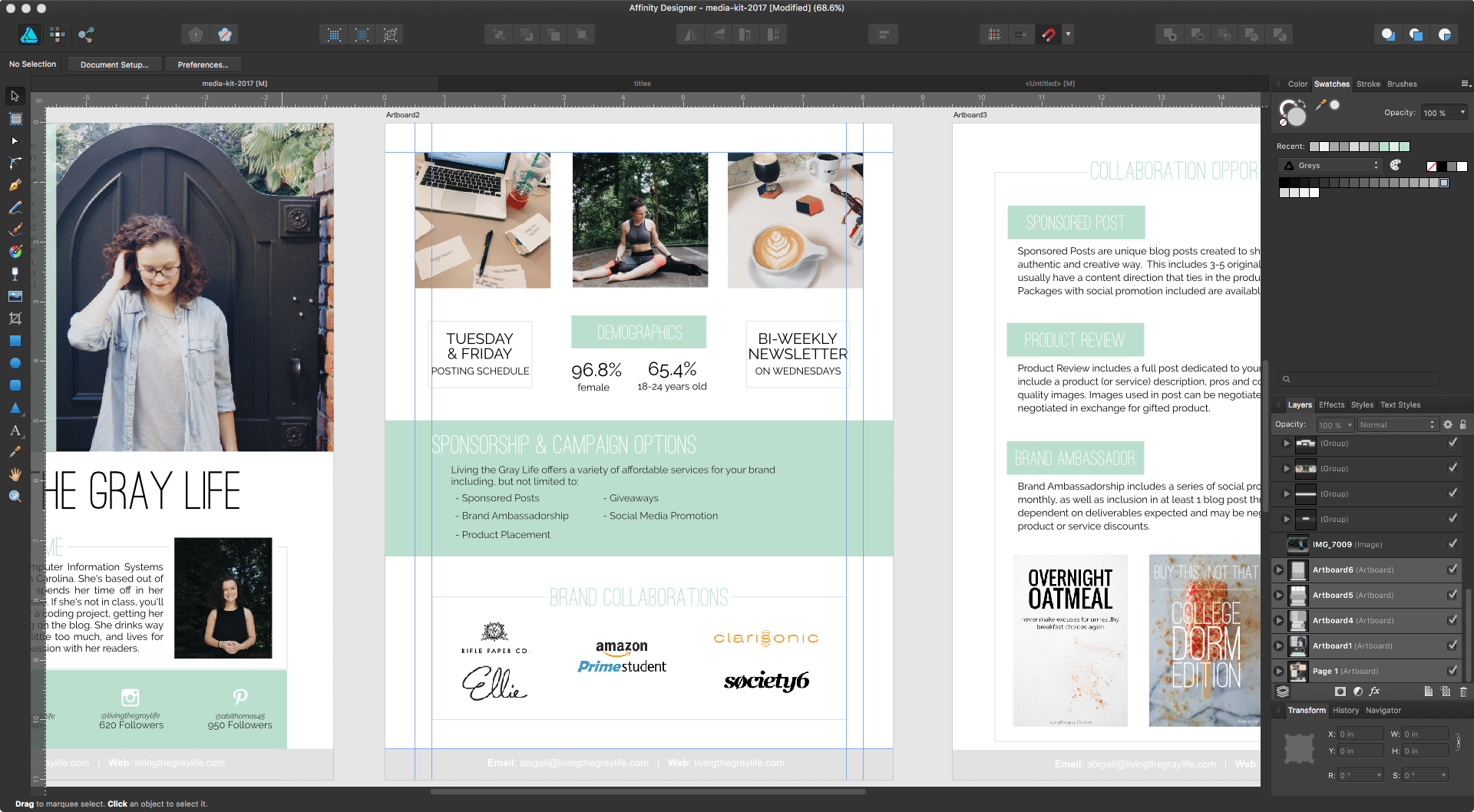
I designed everything in Affinity Designer. It’s a Mac-based design software almost identical to Adobe Illustrator, but instead of having to pay $20 each month for access like Adobe, it’s a one time $50 fee and the software is yours to keep. Being honest, it’s the best investment I’ve ever made, and it does everything I need it to.
You can also use programs like Canva and Illustrator to achieve practically the same results.
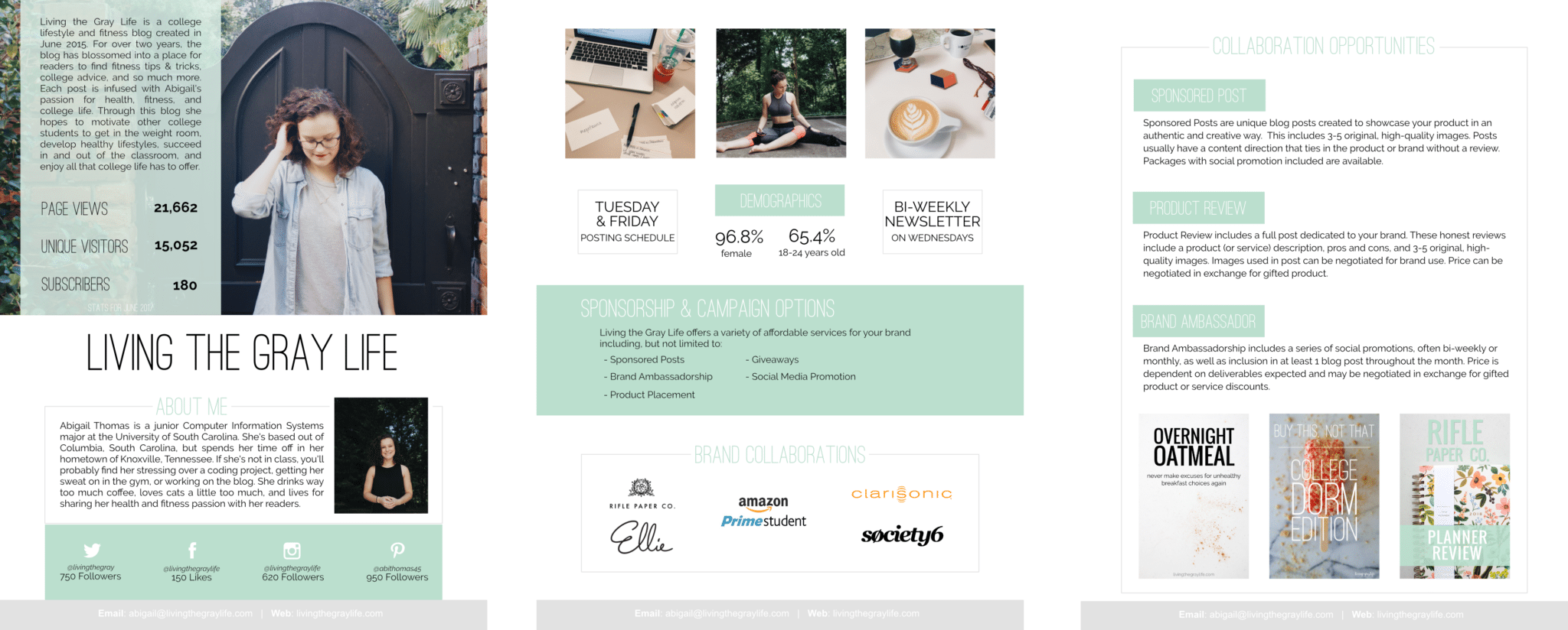
Page 1
- Blog title
- About the blog
- About me
- Blog tats
- Social media stats
This is the first thing someone is going to read so you should make it pop. I included a picture from a photoshoot last fall in front of my favorite door of all time. It works perfectly with the color scheme, and it’s not too overpowering that it distracts from the overall look of the page.
Page 2
- Demographics
- Sponsorship opportunities
- Previous brand collaborations
- Recent Instagram posts
- Other fun facts like my posting schedule and newsletter schedule
Page 3
- Detailed explanation of sponsorship opportunities
- Examples of blog cover photos
- Sponsorship pricing (not pictures)
Prior Media Kits
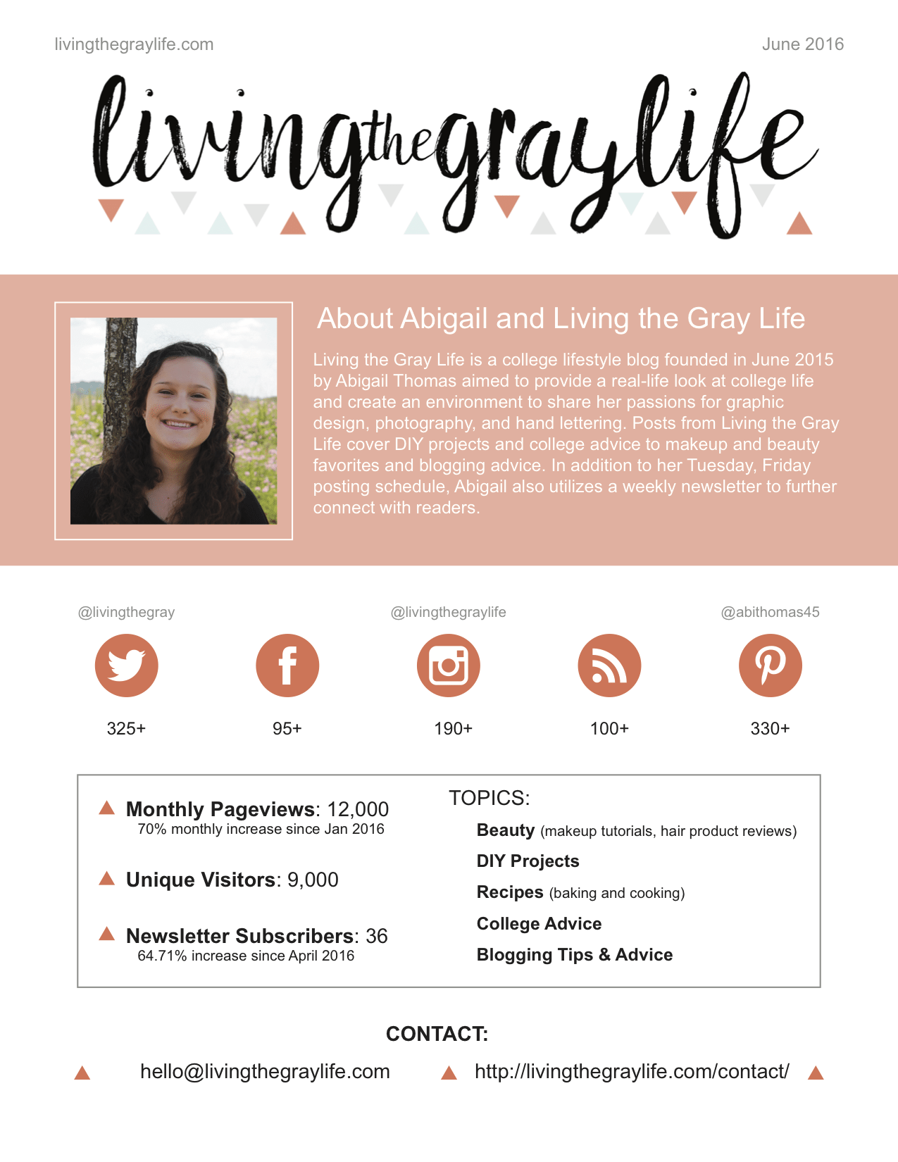
Y’all my media kits have come a long long way since I first started. I had to go searching through my email to find my oldest one.
Summer 2016
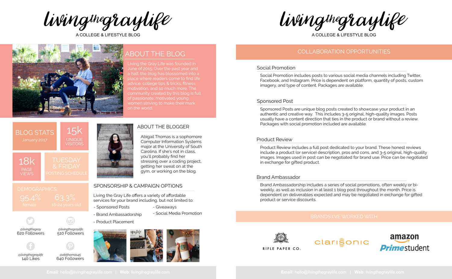
Winter/Spring 2017
The media kit above was honestly the first thing I created for the blog that I felt represented me and the blog in a great light. This one was a lot more detailed, and honestly I loved it. Even throughout this one, you can see consistent branding, it matched my blog almost perfect, and I even became confident enough to include collaboration opportunities!
I would’ve kept this same one, but with the rebranding that happened this past summer, I just wasn’t feeling it anymore. The layout was a bit too crowded for my taste, and if you look at the first page, there’s just a lot going on.
Summer 2017
And now we’re here. Y’all I’m low-key obsessed with this. I think it represents my brand perfectly, it highlights my photography, and it shows what my blog does. I like to stick with three main colors because any more than that and it just gets complicated. While I don’t include my actual logo in this media kit, using the plain font allows the name to stand out and seamlessly flow with the rest of the media kit
Final Tips & Tricks
If you don’t have huge numbers and your social followings are small, that’s 100% okay! I can tell you that every single blogger has been in your shoes at one point in time. There are ways to highlight your early growth that can be beneficial to you!
- Show your monthly stats, but also include the % of growth from either the prior month or from the month when you created your blog.
- Do the same with your social followings.
- Make sure to include the month and year you created your blog and maybe a phrase like “BLOG NAME is an ever-growing college lifestyle blog created in May 2017. Over the past three months… ” in the ‘about the blog’ section
Before you send off your brand new media kit to brands, send it to a few bloggers to take a look. You’ll get genuine opinions, and it’s nice to have a second or third set of eyes check for typos!
I’m always willing to help out fellow bloggers and take a look at their media kit! If you want to send yours my way, I’ll be glad to take a look.
Now that you have all this new media kit knowledge, I hope you go off and create something beautiful! Good luck!
What questions do you have about media kits? Do you have one for your blog? If so, how’d you make yours?
~abigail gray

